Breaking Down Barriers: Streamlining Cross-Border Payments for Africa
Reimagining the UI/UX of a Klasha finance app to simplify transactions between African countries and other markets. Check out Arounda’s design and brand identity services that make a difference in cross-border commerce.
- Branding
- UI/UX Design
- Headquarters
California, USA
- Industry
Fintech
- Website
- funding
$4.7M
The client
Our client, Klasha, is a fintech company delivering cross-border payment solutions for businesses and individuals in African countries. Each financial product they offer aims to provide borderless commerce by allowing consumers and retailers to make and receive payments in their local currencies. Having covered six African countries, Klasha plans to expand its services to drive the adoption of fintech further.
Challenge
When creating this fintech platform’s design, the main challenge was considering and comprehending the brand’s tone of voice and implementing the updated UI/UX following the client’s needs and vision. Arounda experts needed to recognize Klasha’s primary stakeholders’ requirements and the feelings they aimed to convey through design. Another concern was creating a UI/UX according to the user portrait described by the client.
Our Solution
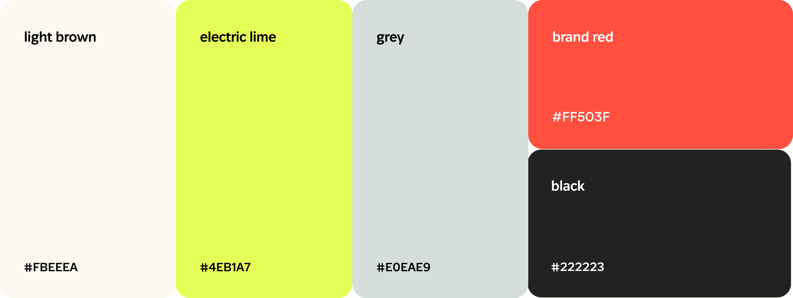
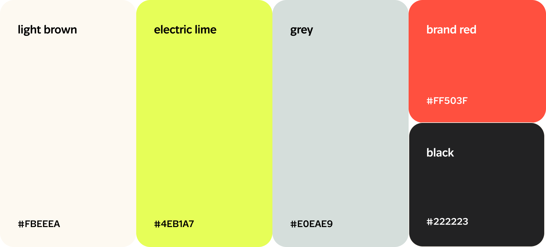
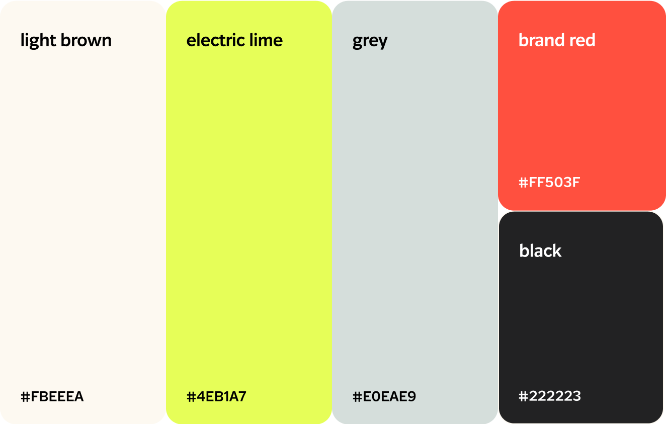
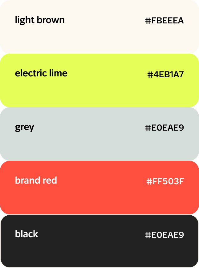
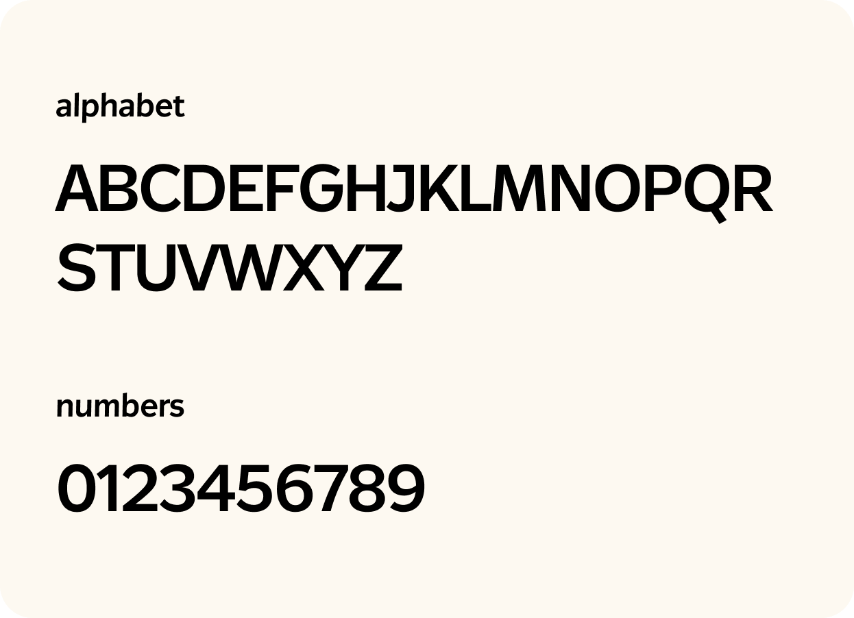
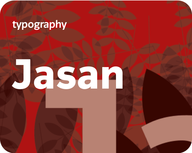
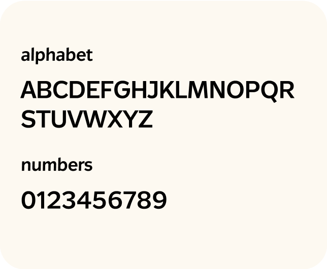
To achieve the goals set by the client, namely: compliance of the design with the brand’s tone of voice and the end users’ requirements, our experts created a brand book and a brand guideline. There we interpreted the basic pattern that can be used for all Klasha products: website, mobile app, etc. Our team created a color palette, selected typography, and determined the basic style to harmonize all the client’s finance solutions.

The process of Klasha Product Design
- Research
- User Flow
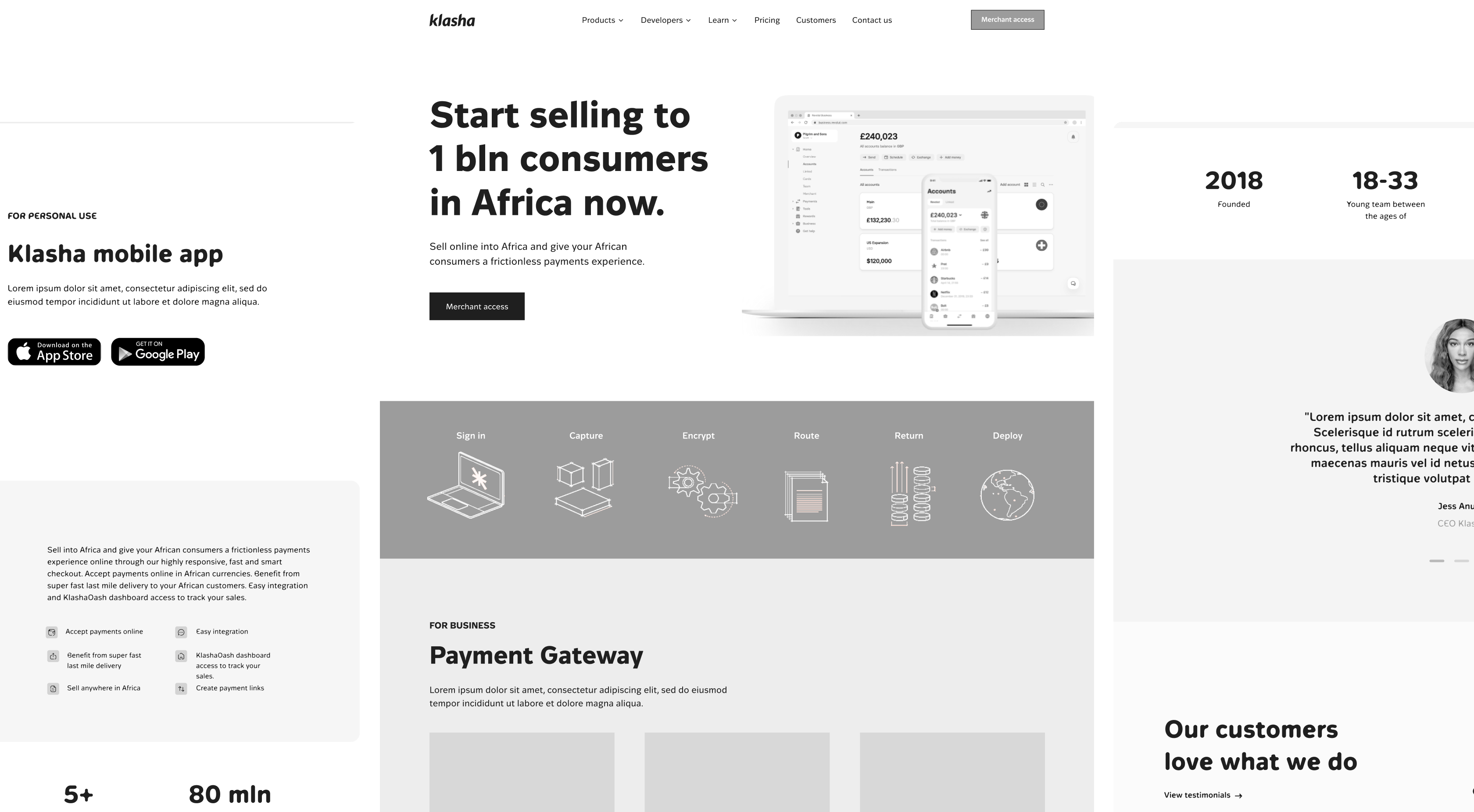
- Wireframes
- UI/UX Design
- Development
Driving Borderless Transactions in African Countries
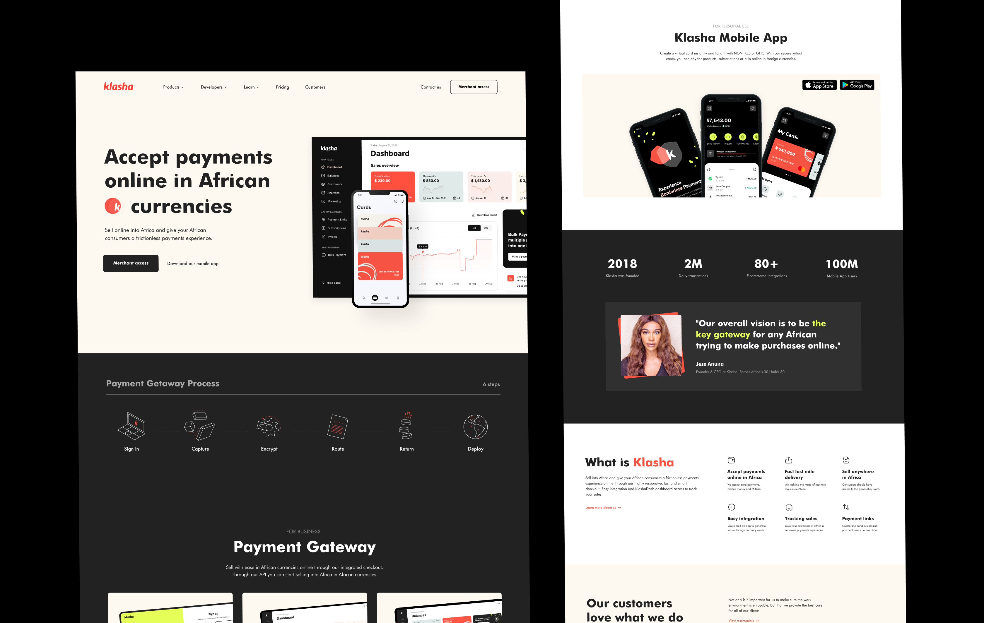
In this fintech work example, our team has designed several financial solutions that radically stand out from the competition. We also ensured that the refreshed UI/UX matches the company’s tone of voice and the requirements of key stakeholders.
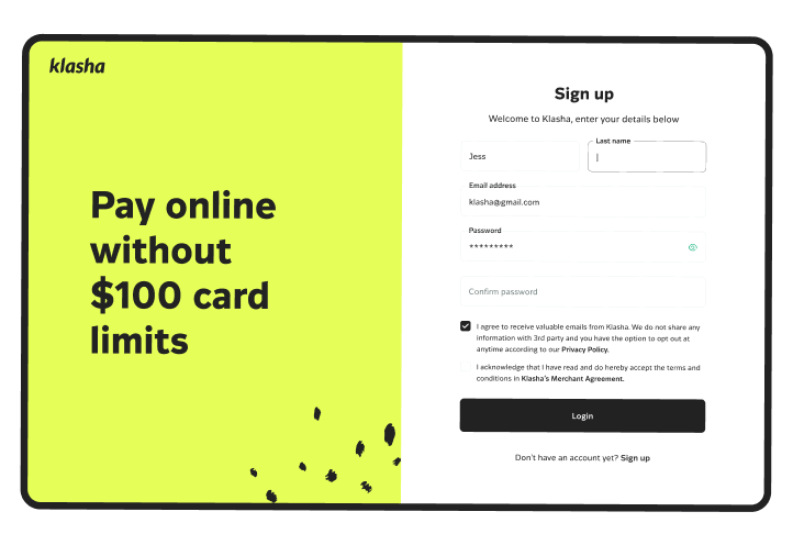
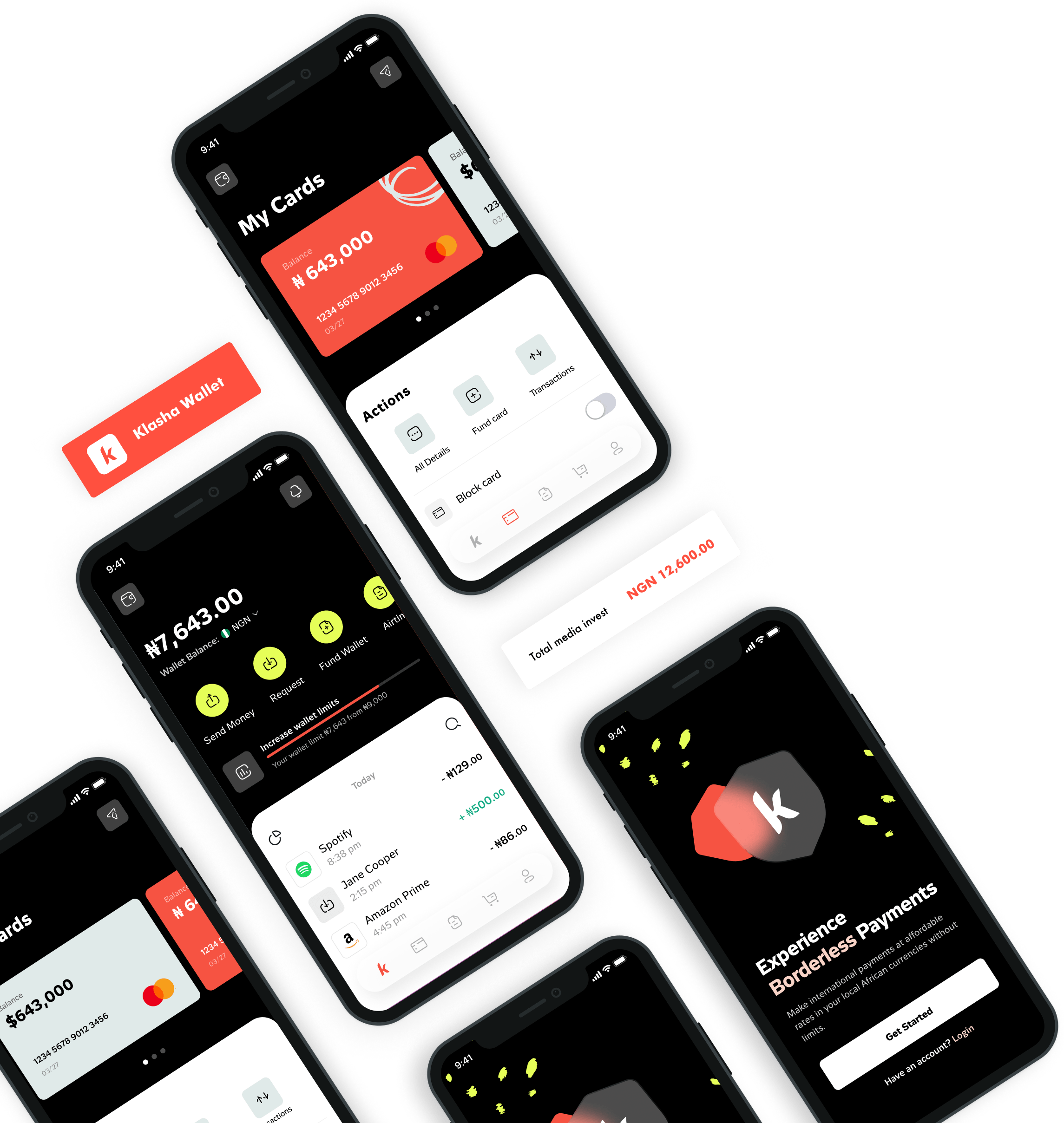
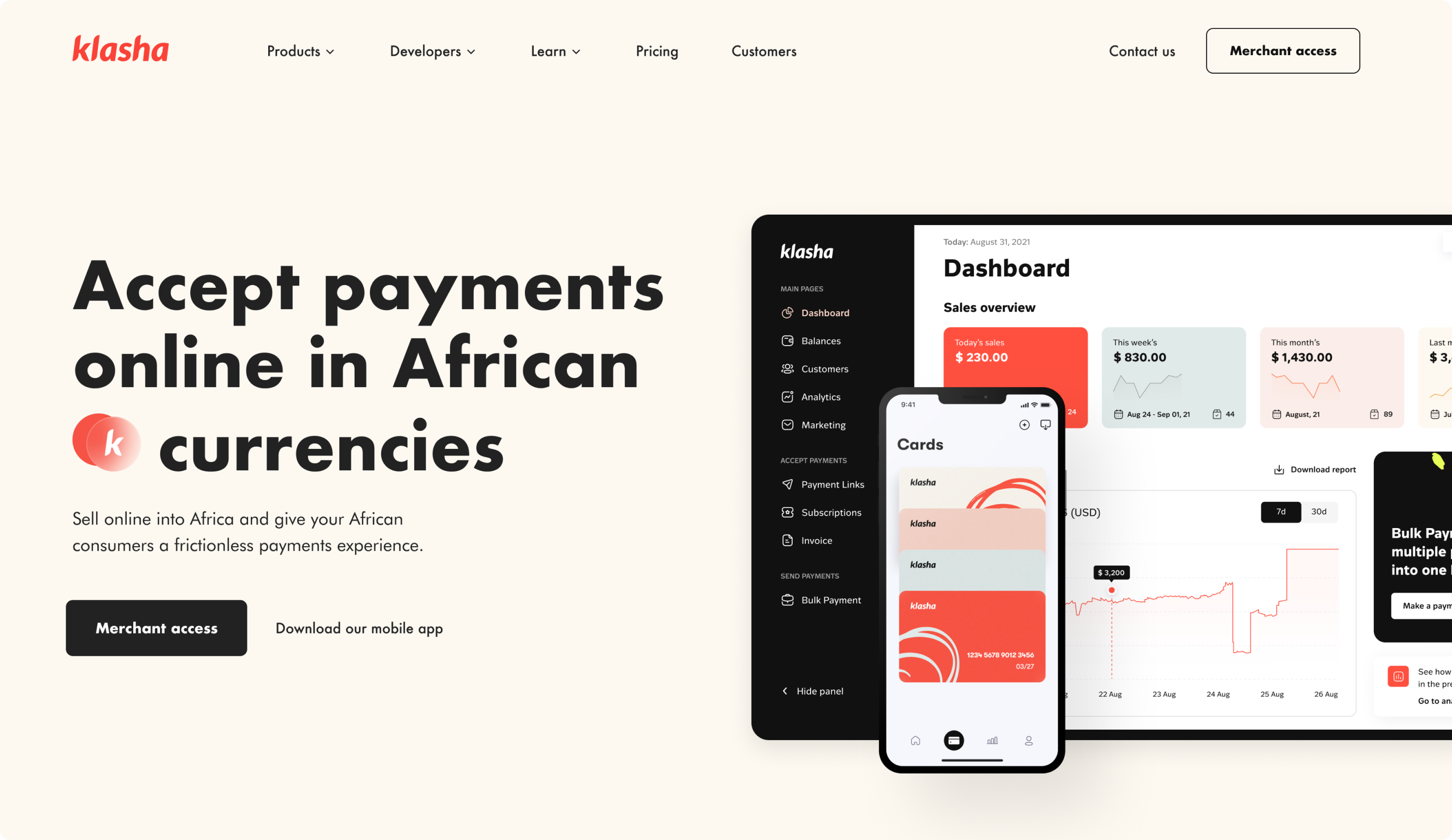
Fintech Platform UI/UX Design
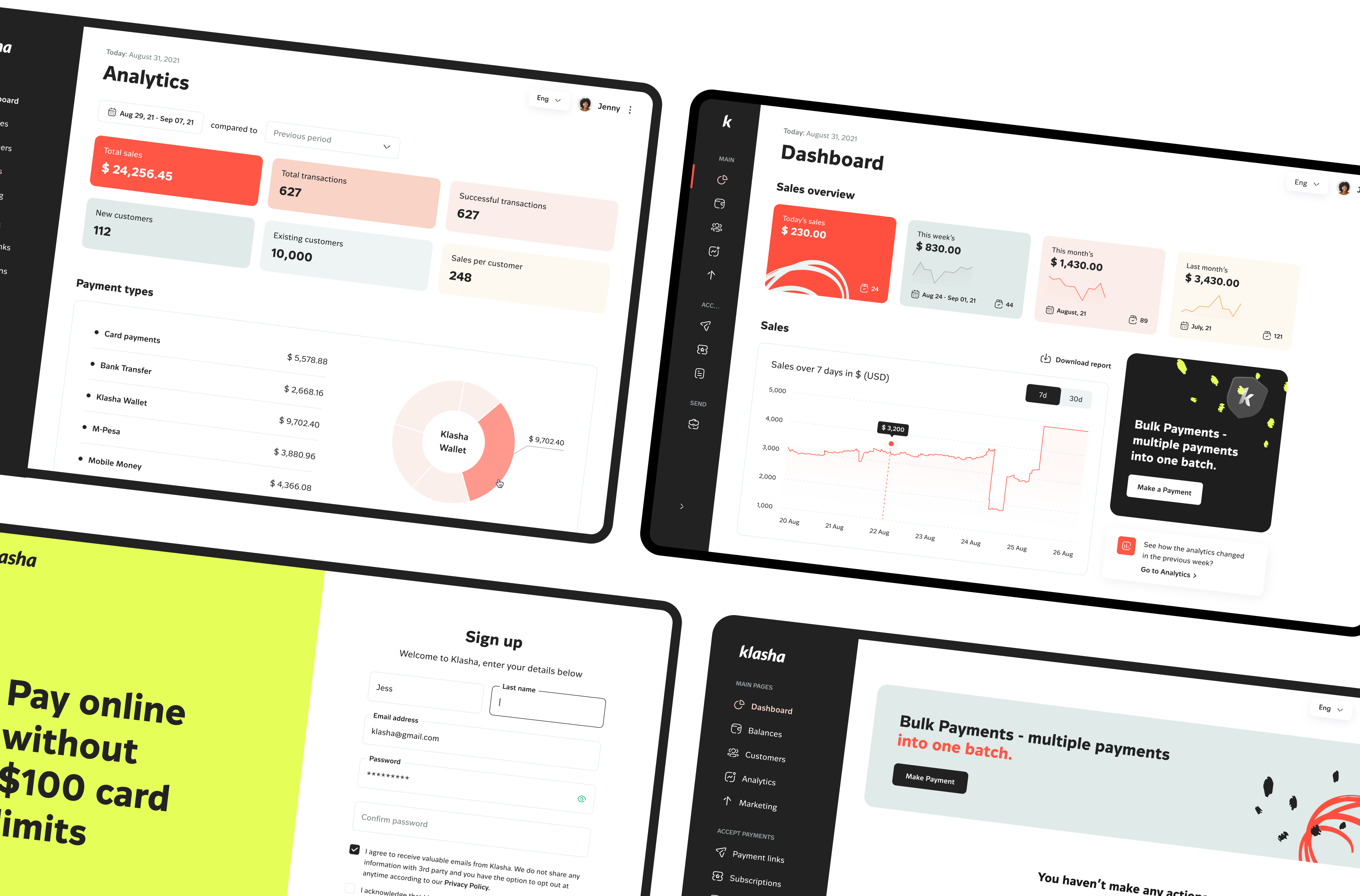
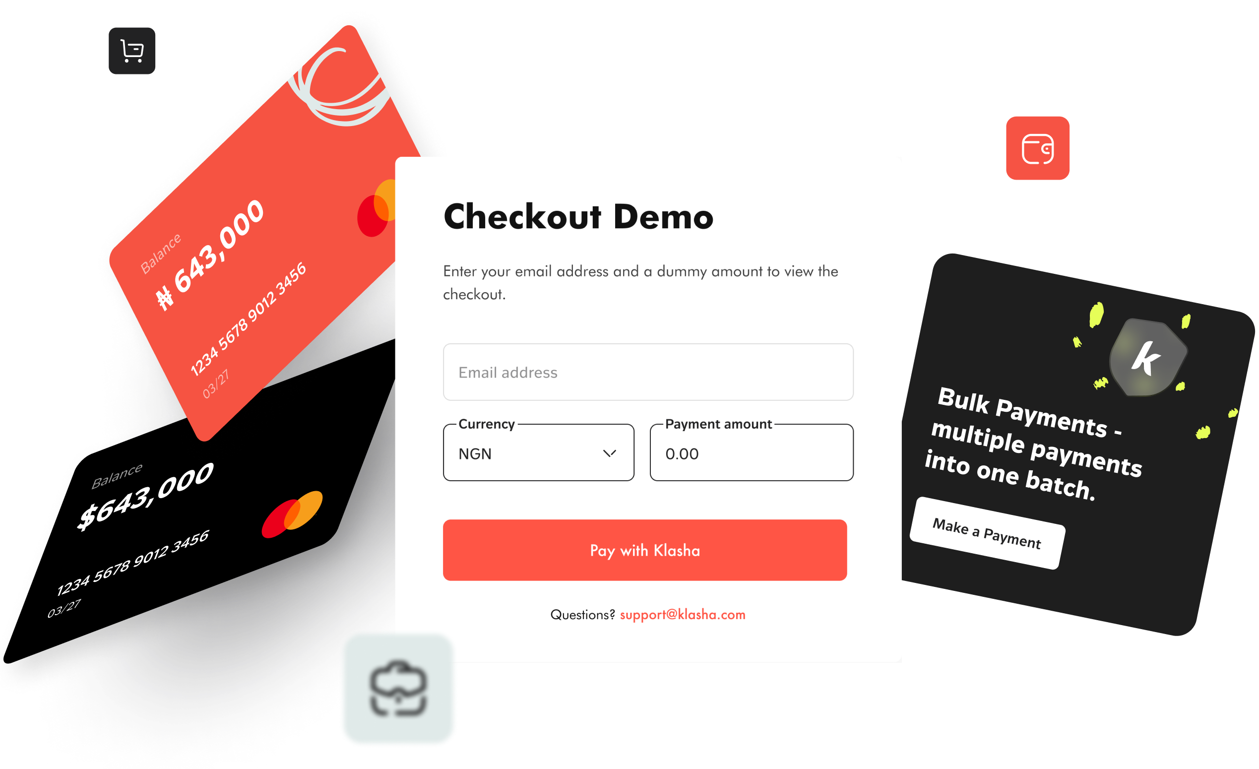
Our team had to make digital payments as simple as possible for users of the Klasha money transfer app. We took care of the intuitiveness of the transaction process and delivered a user-friendly interface.
Klasha Brand Identity
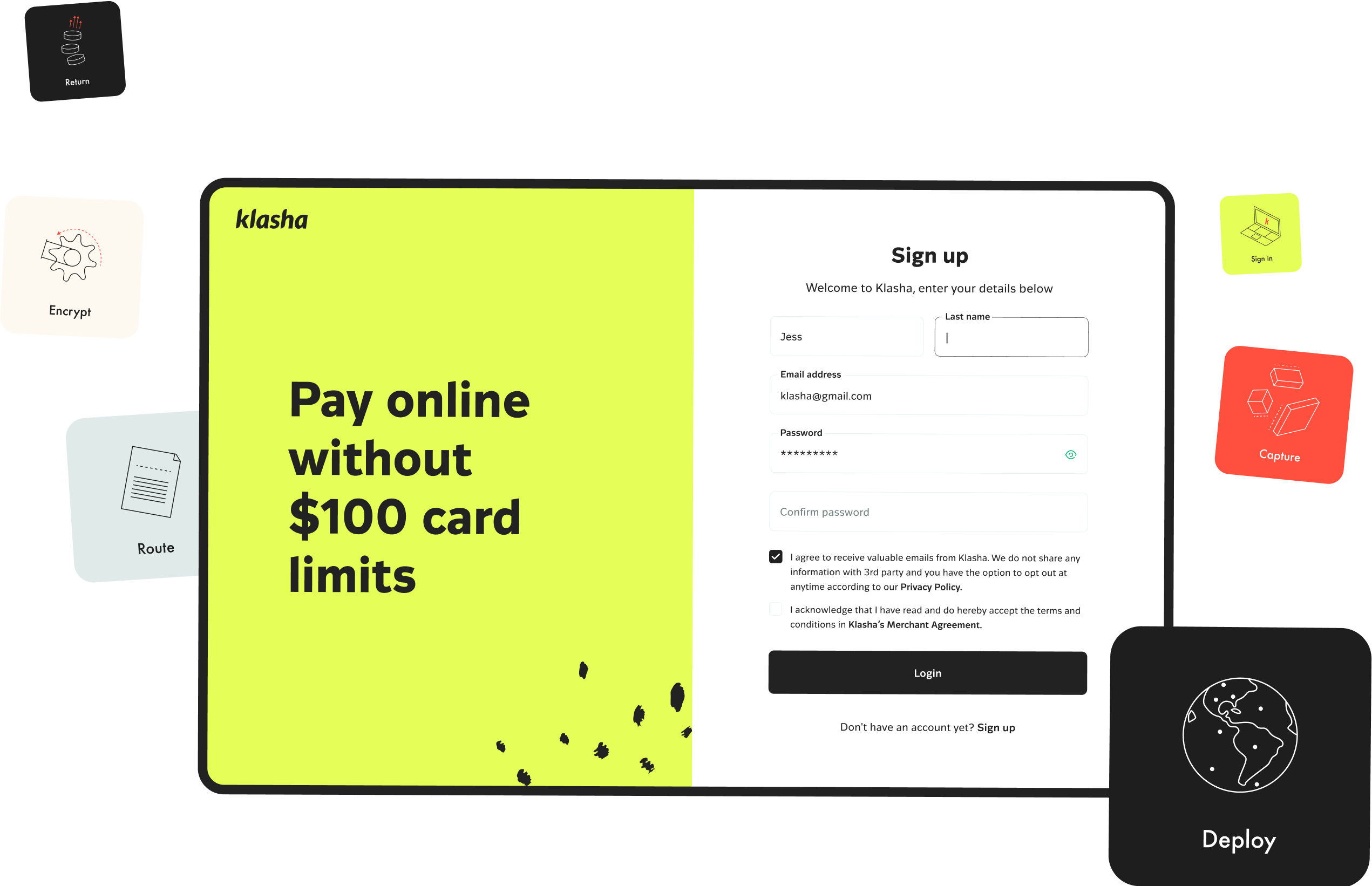
Our experts received and analyzed input from the client and key stakeholders regarding their requirements and vision for Klasha’s financial solutions. Based on this information, we developed a universal brand identity for all the client’s FinTech products.

Marketing Materials
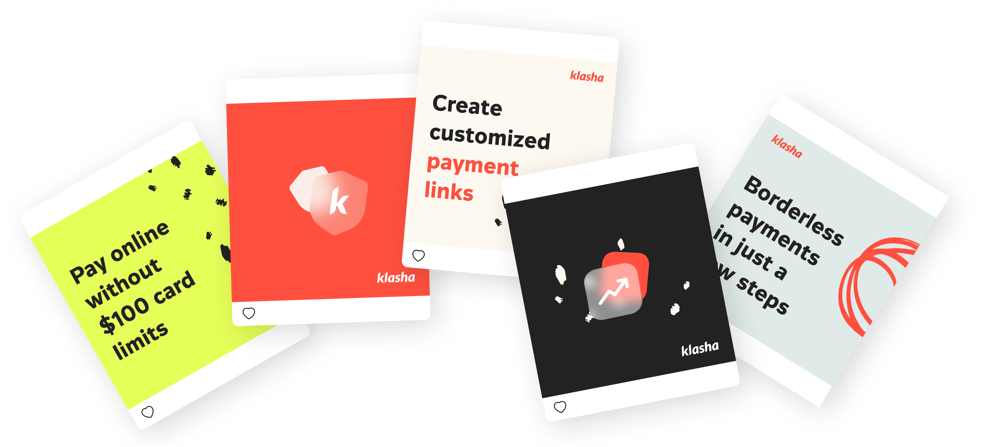
Arounda experts also took care of marketing materials, which is critical in making the right first impression on customers and building trust in social media.
30%
Increased conversion ratesOur top-notch UI/UX design helped to boost conversion for Klasha bank solutions.
35%
Improved user satisfactionWe delivered consistent UI/UX across all Klasha products to ensure higher user satisfaction.
180K+
Active usersWith our assistance, Klasha retained a significant number of active users.
300K+
App downloadsKlasha surpassed 300K downloads with the help of our UI/UX design and brand identity services.
