Thought-Through and Intuitive NFT Marketplace
Arounda developed UX/UI design for an NFT marketplace. Ultimately, we created a product that meets all the customers’ requirements. Read this Web 3.0 product case study to learn the details.
- Web Design
- UX/UI Design
- Headquarters
New York, USA
- Industry
Web 3.0, NFT
- Website
- Timelines
6 Months
 About the project
The client
MintySwap is a US-based digital marketplace for crypto collectibles and non-fungible tokens. The web application allows users to buy, sell, and discover exclusive digital assets as well as upload and create their own NFTs.
Challenge
Our biggest challenge in this Web 3.0 product design case study was studying the NFT environment. So, we’ve consumed gigabytes of educational materials, researched top marketplaces, and explored NFT wallets. Moreover, our team went almost through the whole process of non-fungible token development. In the next stage, we analyzed the market and carried out competitor research within the most popular cryptocurrency marketplaces.
Our solution
Our main goal was to design a trendy web application where users can explore, import, mint NFT, and create their own NFT collections. We aimed to develop a unique solution that would fit the market of non-fungible tokens. Thus, Arounda started with detailed competitors’ research. We registered on various crypto platforms, tested their functionality, and investigated user flows. This way, we collected best practices to reimagine them in a seamless user experience for MintySwap.
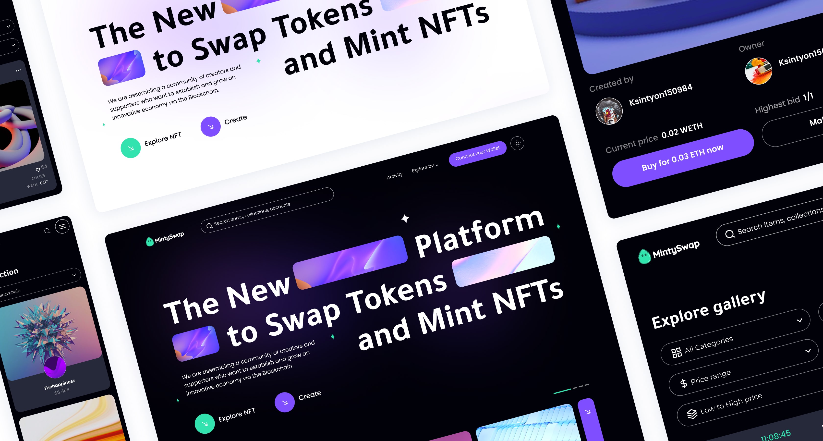
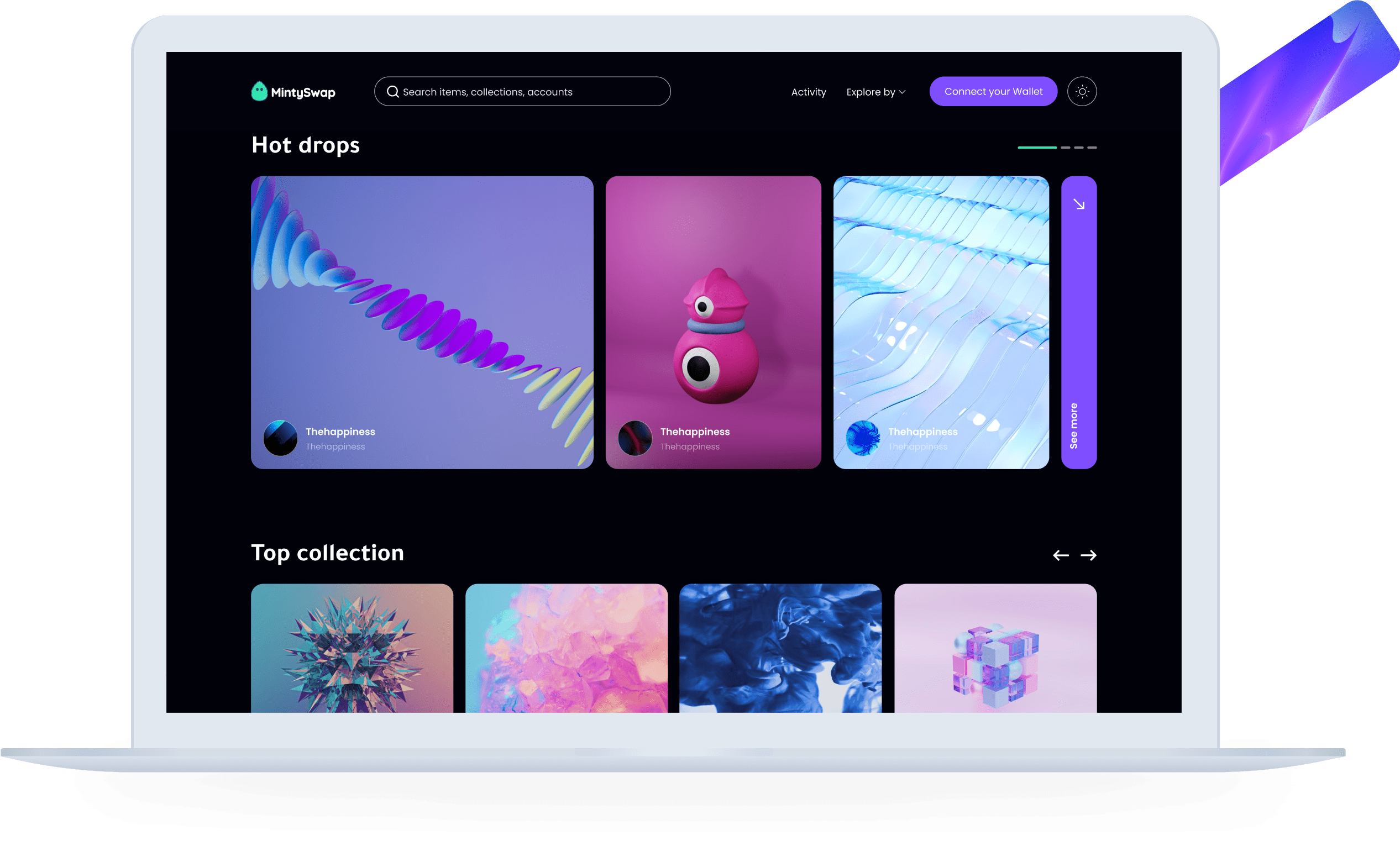
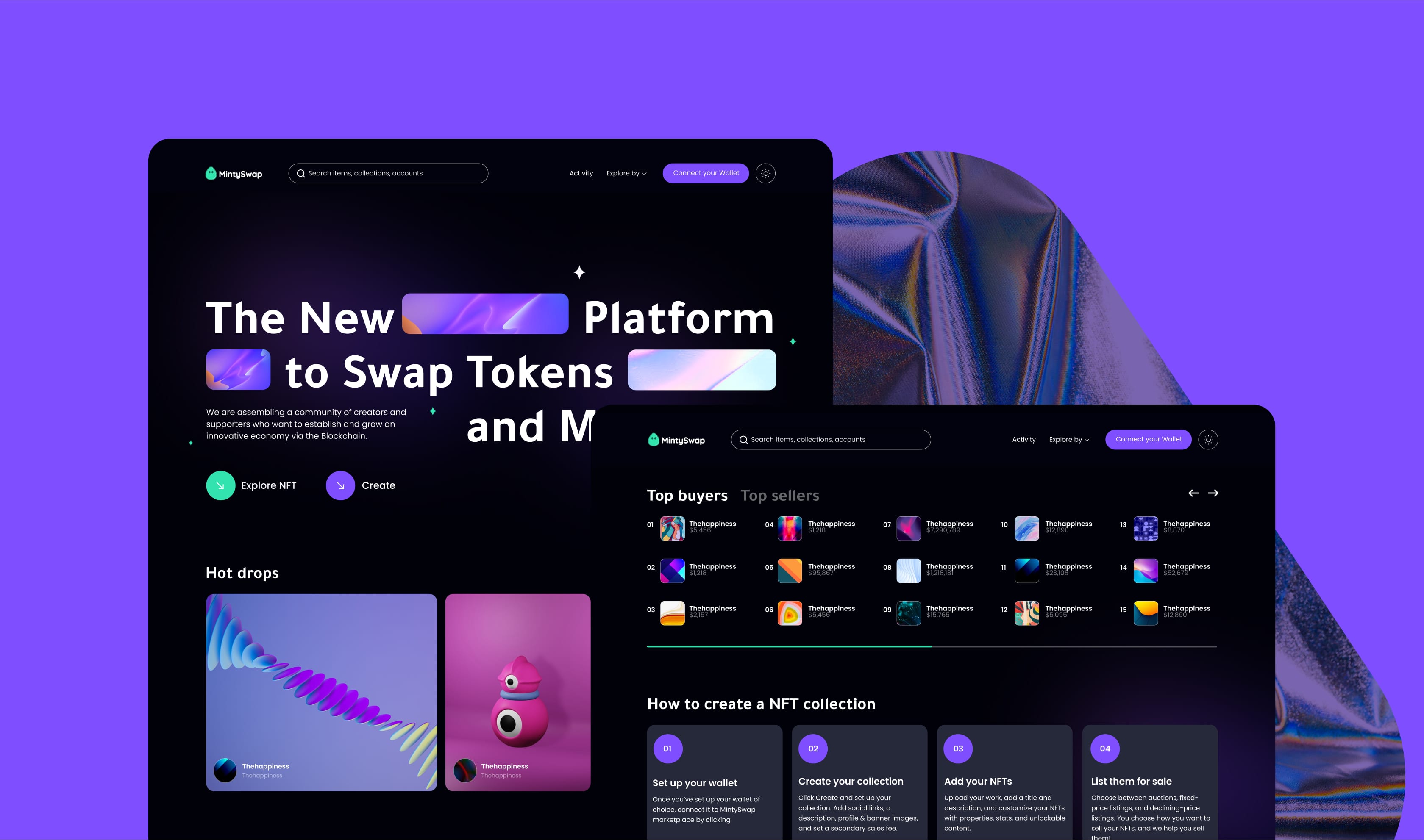
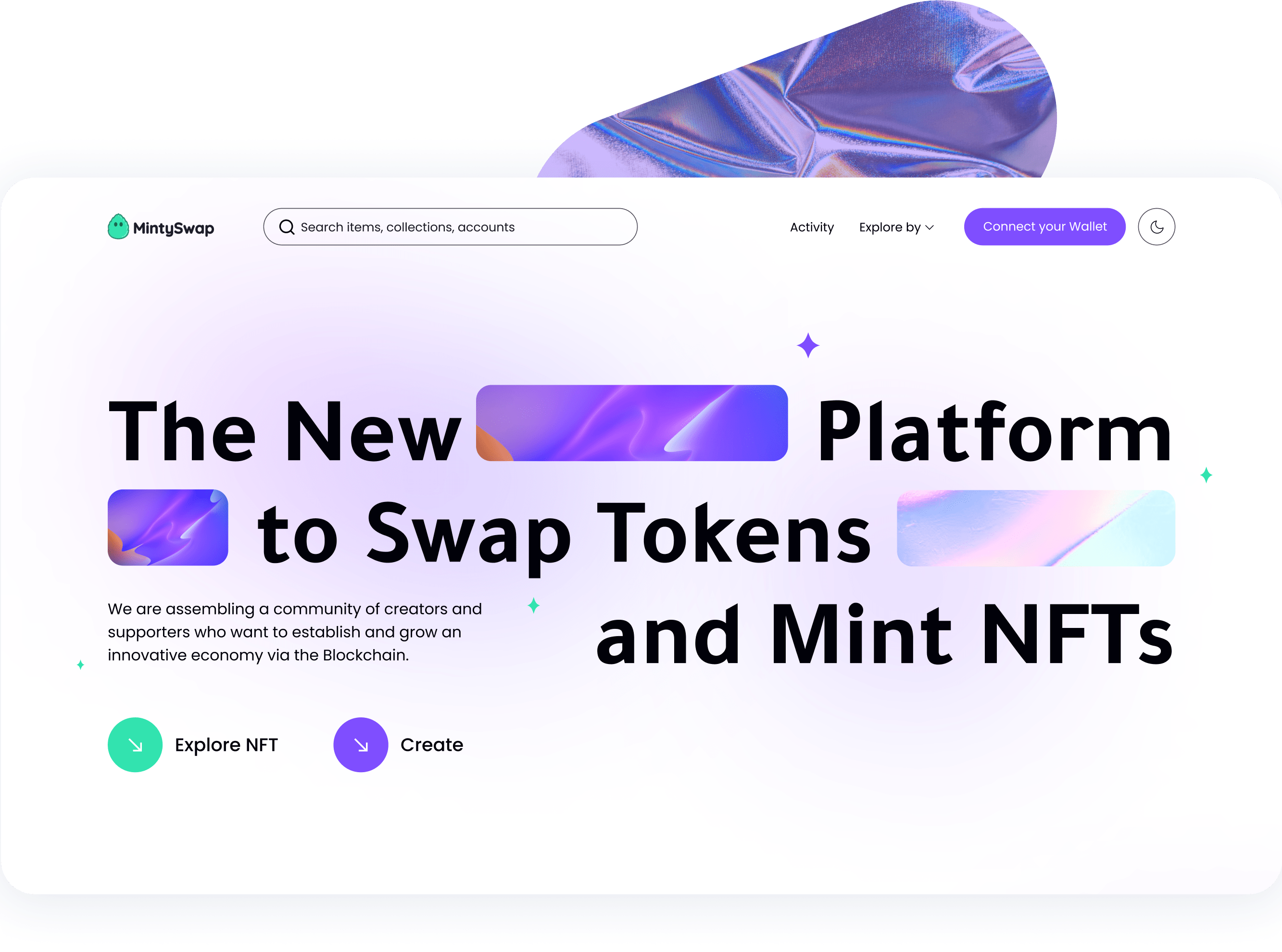
The Fresh New Platform to Mint NFTs and Swap Tokens
The client needed a new trendy-looking web application. In this crypto case, we helped with the UI/UX redesign and proposed how to improve functionality. To create a contemporary web application, we started with competitors' research, conducted a UI/UX audit, and proposed our vision of the website and additional features. This is how we proceeded with it.
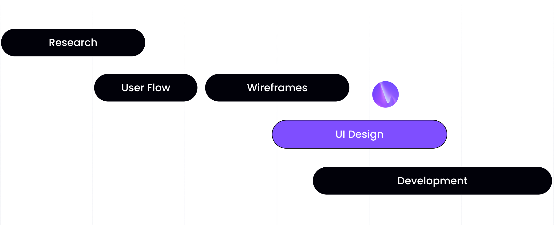
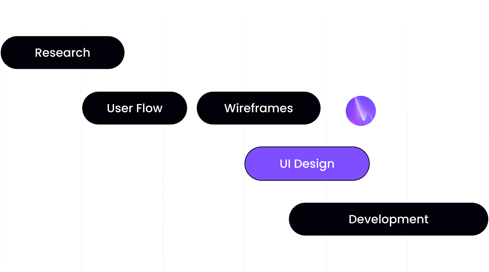
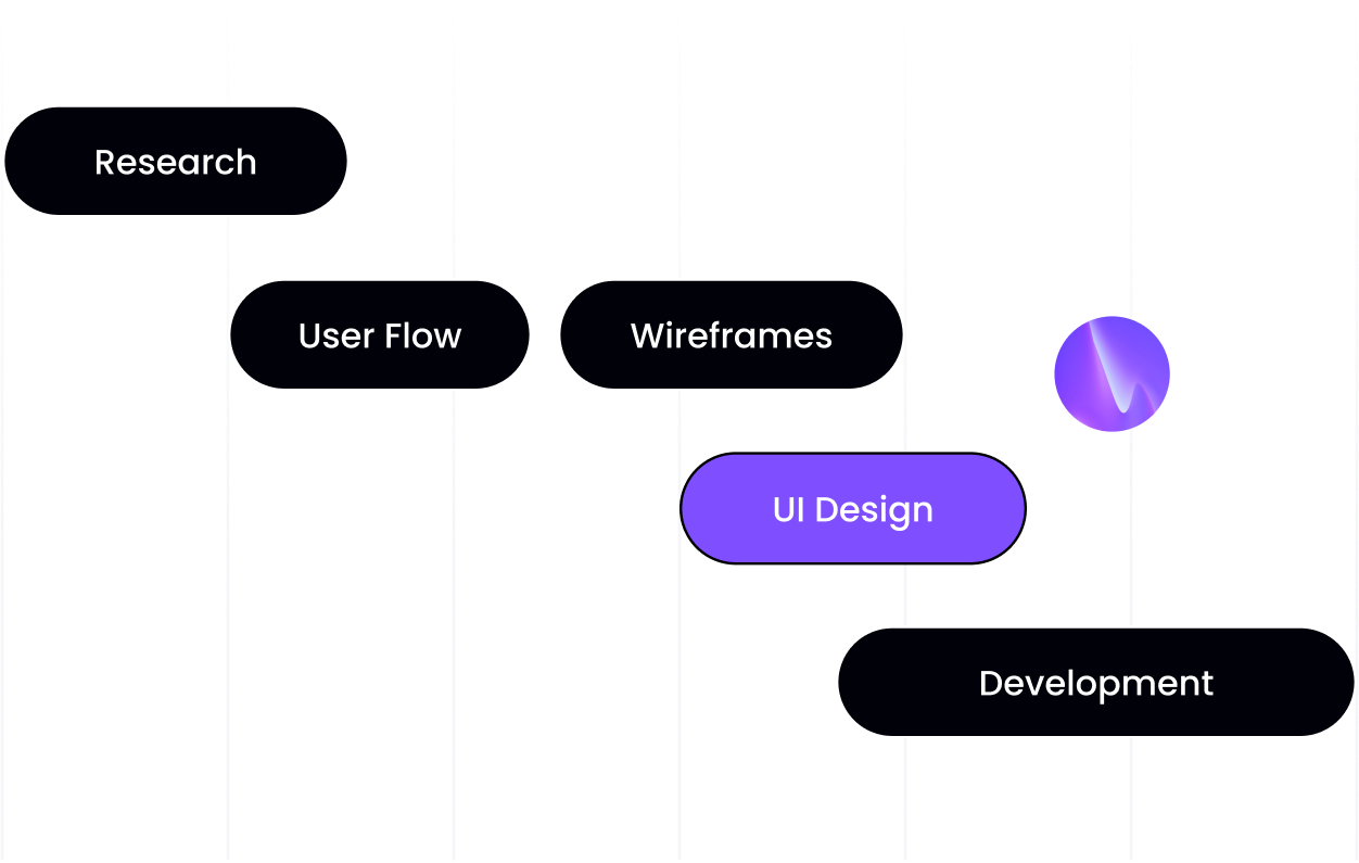
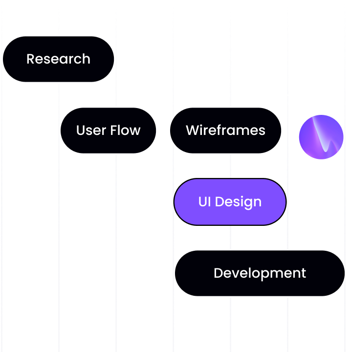
The process of NFT Marketplace Product Design
UX Audit of Web 3.0 product
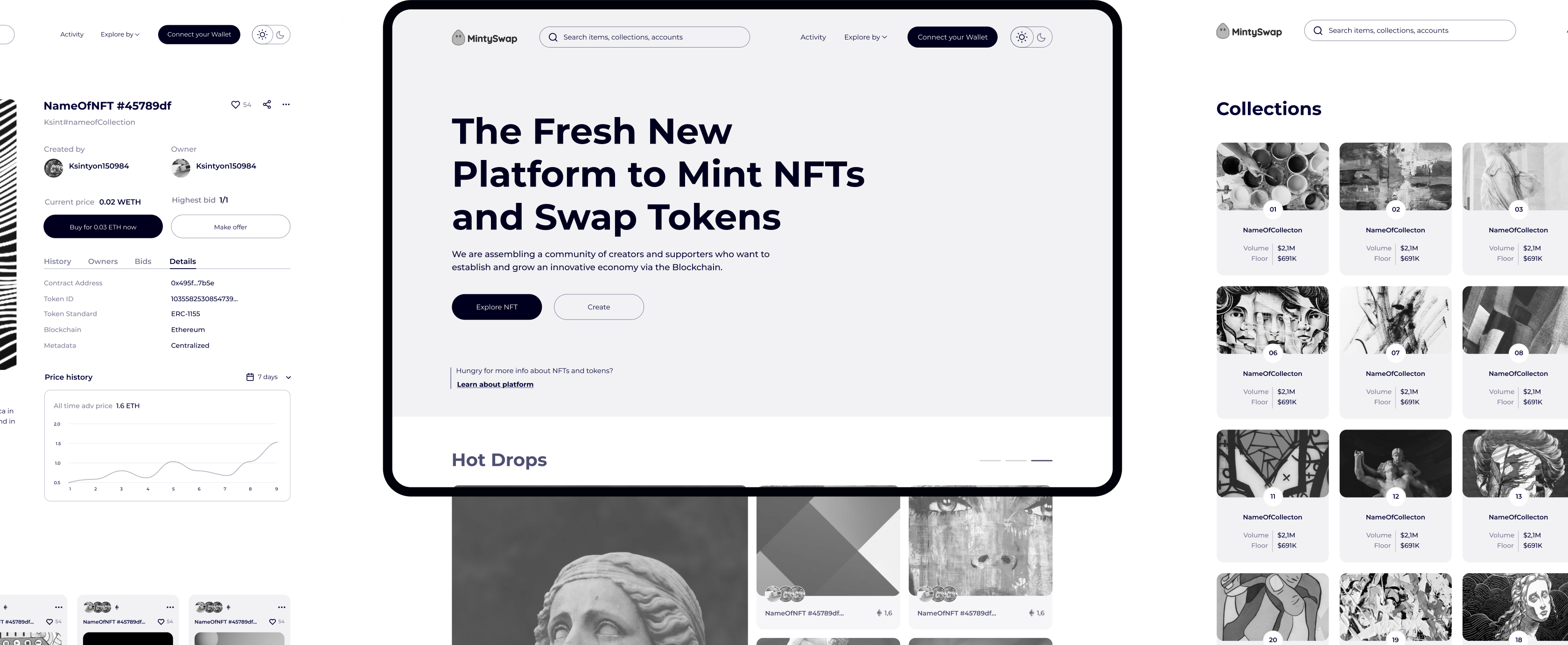
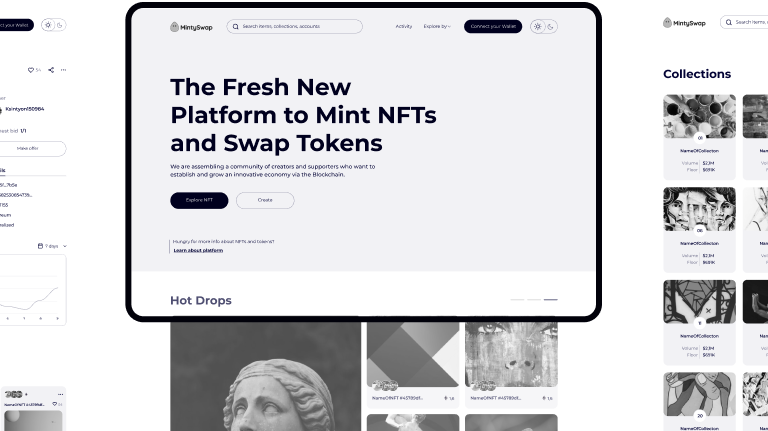
To optimize the existing MintySwap application, Arounda analyzed the UI/UX and marketplace functionality. We examined how intuitive and human-centered the resource was, tested loading time and onboarding procedure, and looked for technical errors. As a result of the UX audit, we presented a summary of current problems, improvement recommendations and created the wireframes.
Rethinking the UX/UI
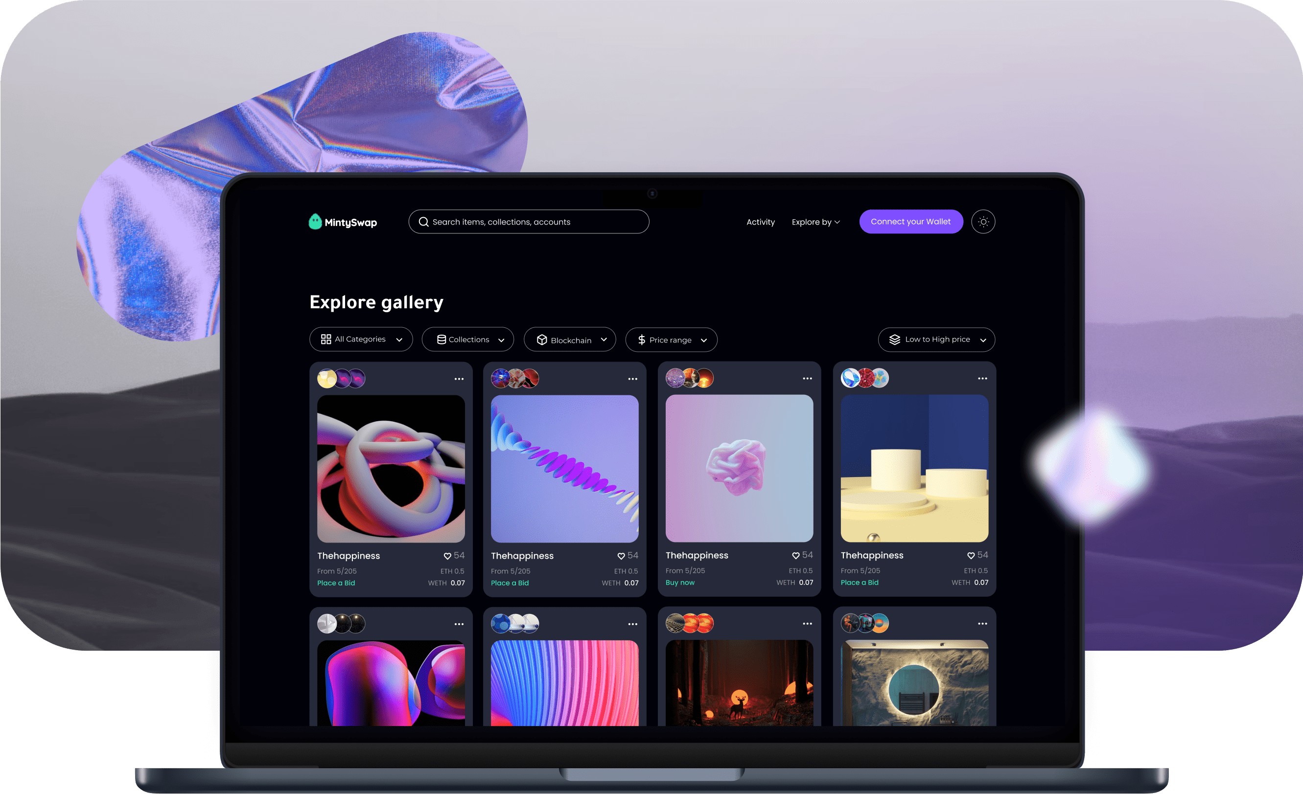
Our job was to rethink the UI/UX design of the NFT marketplace and meet the client's need for a trendy, not overloaded, and competitive web solution. Arounda proposed a professional vision of the project and additional features to widen the functionality. For the purpose of simplicity, we offered a lightweight and straightforward design with all the necessary functions.
Implementing the New Design and Functionality
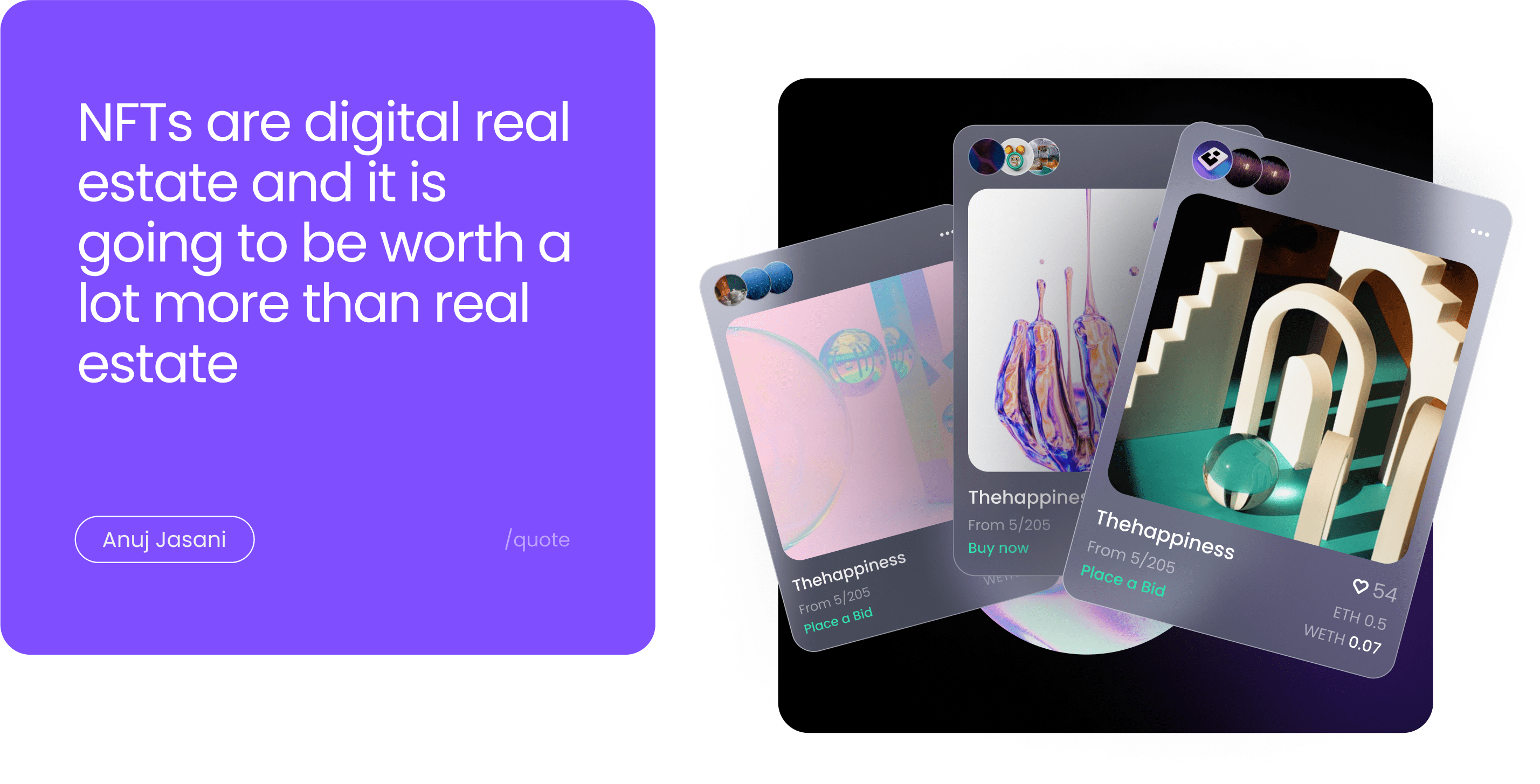
Arounda team created a contemporary, elegant, convenient NFT marketplace. We improved both design and functionality. Thus, the web application meets all the customers’ requirements and matches the target audience's request.

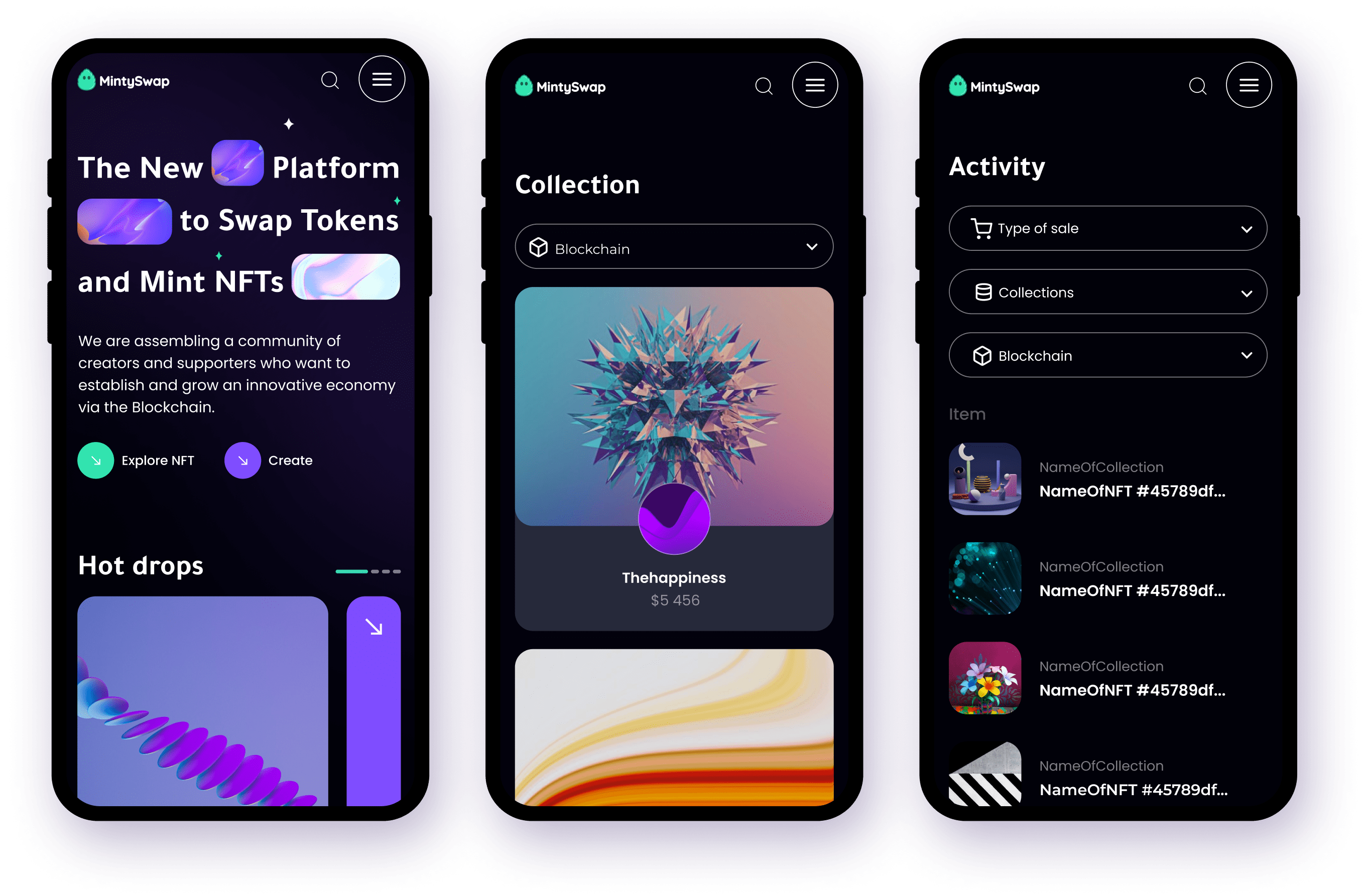
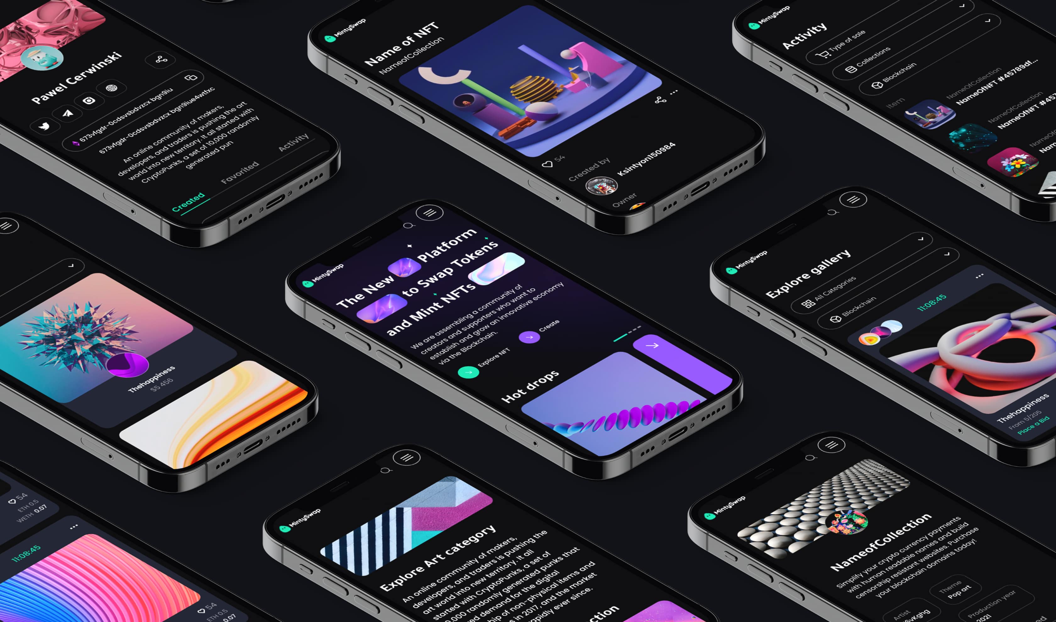
Responsive design
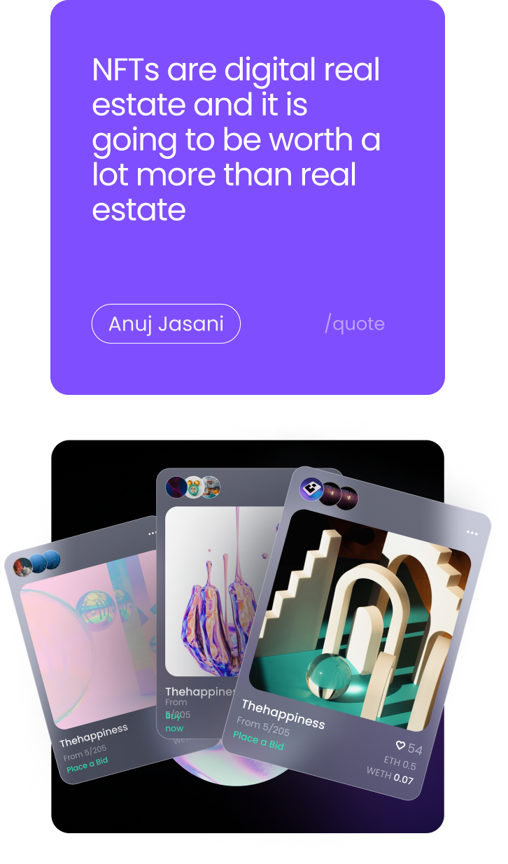
Given that a big number of users prefer browsing via various devices, we also designed the responsive version of NFT platform where the user can easily connect the wallet, browse through NFT`s and exchange, or ‘swap’, various digital assets from any device.
Visual style
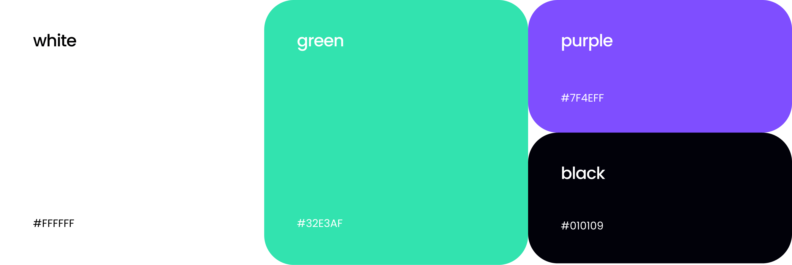
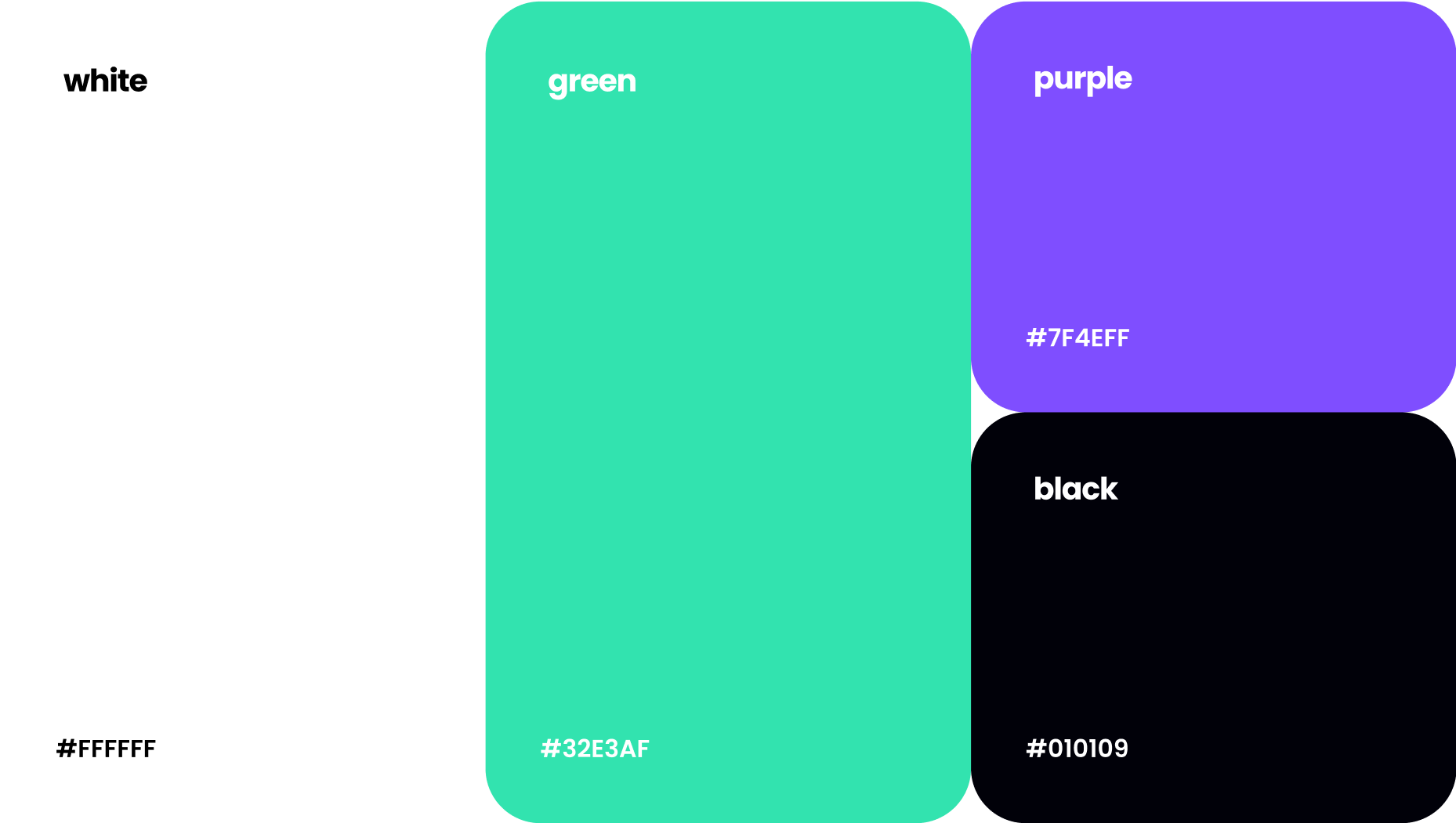
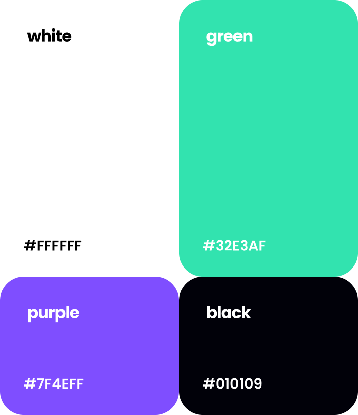
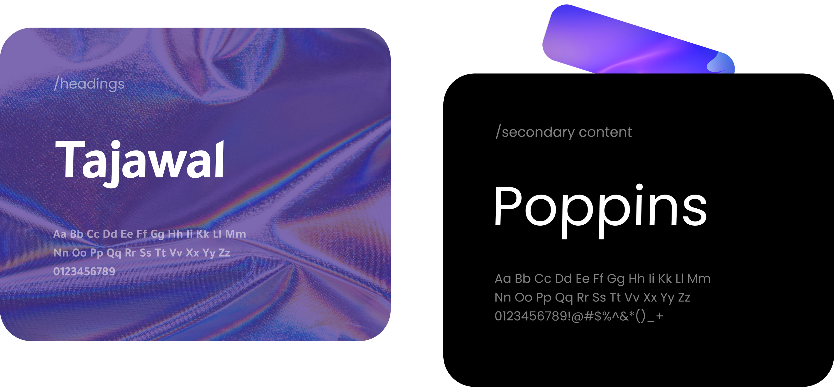
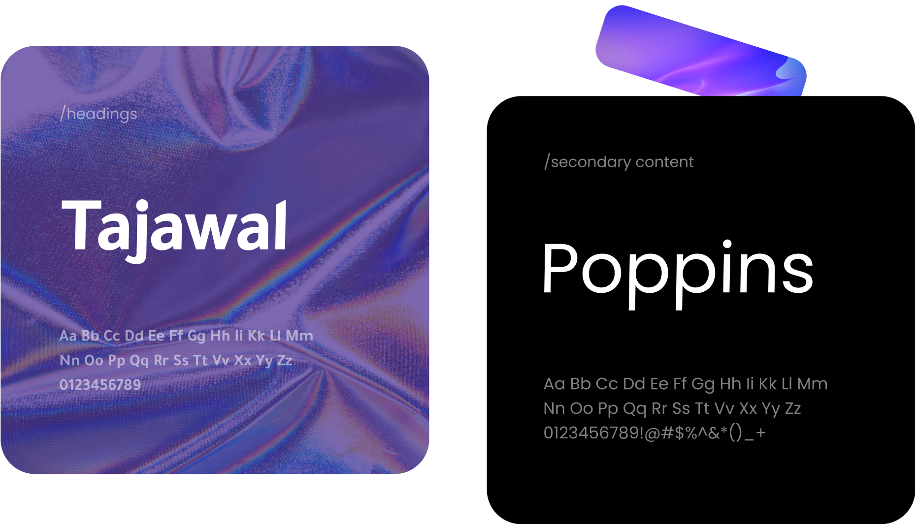
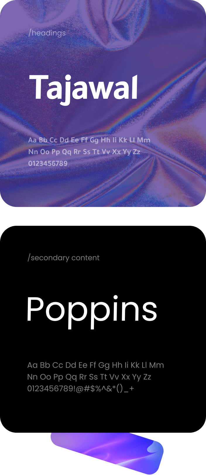
We followed the client’s guidelines and delivered solutions that would fully correspond to the needs of the target audience. We focused on communicating the ease of use and accessibility that MintySwap offered its audience and brought the millennial spirit to live.
5%
Engagement rateOur experts proved this by delivering a top-notch intuitive UX, which increased user engagement.
+22%
Increase trafficAs a result, the traffic of the MintySwap product increased along with the conversion rates.
x2
Community increaseWe`ve improved MintySwap design & marketing efforts that helped to increase the community.
21%
Reduced bounce rateRefreshed design reduced the bounce rate of the platform.
